Digital Tabletop RPG Project
The Malazan Books of the Fallen, unofficial games project.
Concept Artist and Games Designer
Personal project producing an adaptation of The Malazan Books of the Fallen, compatible with 5th Edition Dungeons and Dragons.
Producing world building adaptations to build upon the world in the story, and making it compatible with various races in D&D. Designing encounters and gameplay that is fun for players who have never read the books.
Creating artwork for both characters and amps for use on digital tabletop products.

Overview
Skills
The Malazan Books of the Fallen is a lengthy book series written and created by Steven Erikson with Ian C. Esselmont also writing in the same world.
I was introduced to the Malazan Books of the Fallen at the same time that a friend offered to run for us our first ever D&D game. Sat in a grotty pub in Uxbridge, London, I discovered how much fun the game could be, and as I read the Malazan book I fell in love and found myself crying on the bus. If I was ever going to run an RPG, this seemed like the perfect place to set a more unusual campaign.
Unemployed and studying for my Level 3 in British Sign Language I needed a project, so I started creating my game. Eventually I ended up running it online and this lead to the need to produce a lot of art, a lot.
ILLUSTRATION
CONCEPT ART
PHOTOSHOP
GAMES DESIGN
RESEARCH
Early Design
The original games of Malazan used a system called GURPS, but finding players for a game is hard enough without trying to teach them a whole new system. Because of this I chose to stick with 5th Edition Dungeons and Dragons produced by Wizards of the Coast, as it is by far the most popular RPG system.
Knowing that I was going to find more D&D players than Malazan fans in any given area I set out to create a 5eD&D game inspired by the books, rather than, as many have done, create a perfect rendering of the Malazan fiction as an RPG. You can find more details on my initial thought on my blog.
With world design I had to work out how much of the book setting I could change, to minimise the amount of limitations I would need to make to players choices. Most notable the Malazan books have no Dwarves, Elves, Gnomes or anything of the sort. So how can I physically and culturally redesign them to make it fit? My first blog page exploring answers to these issues can be found here.
Right from the beginning it became clear that most of making it feel right, came down to how things looked. This meant initially describing the world and monsters as looking different. Once I moved to an online game. This meant drawing them differently.
Battle Maps
When I first started running games I got to play in one of those wonderful things, a real life face-to-face game of D&D. So at that time I could do the nice and simple thing, use a mixture of imagination and sheets of paper with hastily drawn scribble on them.
I learnt very quickly that I would have no idea where my players were going to go, so rather than carefully drawing out a map of specific places, I would draw an image of the general layout of the land. That way wherever they ended up having a confrontation, I could create a rough map relatively quickly, or make it from things already on the table. "That packet of crisps there, that is a hill."


When I ended up running an online game this become a lot more of an issue. Suddenly I foud myself have to have maps prepared in advance. One of the first issues I came up against was finding battle maps that fit what I was after. I didn't want to have to design what was going to happen based on what maps I could find. So, it looked like I would have to make my own. The only problem is...I had gotten used to such big areas to play over. How do I know where my players are going to go? How do I answer this.....with giant maps.


As you can see I got a bit carried away.
The ethos behind this was that I didn't want to restrict where players can go. The difference between an RPG and a computer game is meant to be that you can go anywhere or do just about anything. As a Games Master I didn't want to too heavily steer my player's in one direction, simply because that was where I had gotten the map prepared for.
Equally having played online games of D&D before as a player, it can be very frustrating when you are limited by the size of the map as to how far away you can stand from you opponents. It limits a players creativity when you are quote literally within a box.
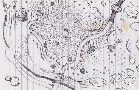
This map was the location of a Barghast Graveyard, where the spirits had become riled up due to the theft of the shamans bones. (For fans of the books this is a combination of two different events from Memories of Ice).
Below is a scene stolen from the books, but comppletely out of place and out of order. This is what I mean by being based on the books, but not shackled to them. Nonetheless, the uncovering of Calm the Peace Bringer is such an important part of House of Chains that I felt it was important to get the art right. I worked meticulously to read through all of the descriptions, to as accurately as possible represent the moment when the cover-stone is removed from her body, the way her hand and feet and created grooves in the ground and how her hair and grown over the eons.

Maps Gallery

I tried here to experiment with showing tree cover on the map, but during game play it became far too cluttered and confusing.

This one large map can be re purposed to either a generic road map while my players are travelling, or into a Forrest encounter.

While on the road the tree cover layer remains visible, but I would turn it off when players approach to reduce visual clutter.

Map Design belongs to Wizards of the Coast From The Forge of Fury adventure, Tales From the Yawning Portal. I wanted to adapt it and mostly just added more stalactites/mights.

Map Design belongs to Wizards of the Coast from The Forge of Fury adventure. Tales From the Yawning Portal.

The first keep I created based off of the Map of Capsutan drawing published in Memories of Ice.

beyond each gate is a large Market Concours which results in a lot of empty space that i needed to fill in interesting ways.


The largest south gate was hard to interpret from the drawing in the book and is never really described. I had to get creative with what I had to go on.

At their longest edge the Keep maps are around 170 squares long. Despite this it needs to still be nice to look at for players when you get close in.

This was my first attempt at drawing a multi stage building interior with interconnecting levels. It was an interesting challenge but in future I think I need to keep the ground floor as part of the main map.

The site of interagency and subterfuge that my players never saw. The shape of the building was based on one seen on the real map so it was an interesting challenge to make it all work together.

A large Noble estate that came with an outline on the city map and some rough descriptions of the grounds. Without a genre in architecture I had to look at a lot of floor plans to work out what was reasonable and based a lot of this on the Harry Potter castles.

The setting means there is not high levels of technology and holdovers from older culture. This means there is a central fire pit in the great hall, bt the focus of the building is a Greenhouse, posing more glass than most people will see in their lives.

Without knowing if my players would even come here I dint detail the ground too much, but I wanted there to be variety in possible combat encounters, and these narrow overgrown pathways contrast with the building interior.

Following the map from the book I could place the outlines of building, but it does not make it clear which buildings are which. I also added a lot of detail that one would expect to see n such a place, such as a blacksmiths and carpenters workshop.

Flowerbeds and an ornamental garden centred on a fountain based on Turkish patters. the Princes Tower is very high, allowing him and guests to view it from high above.

A default modest home. The only confusing challenge was that the books describe "a bread oven with a fire pit." This is what I came up with.
City of Capustan
During one stage of my campaign the players become trapped in the Siege of Capustan, a very important part of the book Memories of Ice. I wanted a more sandbox style of play than the previous stage of the campaign. With no knowledge of where the players might go, I created the key areas where I thought they might go.
Fortunately I knew roughly what these locations would look like thanks to artist Neil Gower, who produced most of the wonderful maps we see at the start of each book.
For my maps I made use of as much description as I could from the books and combined them with exactly what can be seen on the maps. Using research into castle and city design I took some liberties with the city gates, largely to improve gameplay. Based on the descriptions of the city I used largely Turkish historical references for the designs.


City Map- Saltoan
Saltoan is a city that appears very little in the Malazan books but one I wanted to make use of. Without a map I needed to produce my own.
Following my ethos of sticking as close to the books as I can, I went through everything I could about the city; which road led to where, how the canal passes under the bridge at the west gate, four lakes, two of which were in the old riverbed. I had never painted a proper map before and I've gained a great deal of respect for people who do from the process.
The detail level for this map is very high, with the idea again that my players could go anywhere, so if I needed a map, I could just use a small, zoomed in version of the city streets. You can find a few examples of this detail on my Artstation.

Tokens
I realised early on that it would add a lot of extra work for myself if I kept on trying to make up new monsters for my games, but equally, having a regular fantasy Cyclops or Harpy appearing in my Malazan game would not work well. As such I worked to re-skin as many creatures as I possibly could, drastically in some cases. The visuals still had to match their mechanical abilities, but changing a mammal to a reptile and many other simple changes can make a drastic difference to the visual design.
This art design ethos also makes for an improvement to gameplay as well. Many D&D players have become very familiar with the standard monsters. The players either know them so well that they know all their strengths and weakness or become bored of seeing the same things all the time. This way stop players being any the wiser.
I attacked my players with a bunch of Crab Demon people for twenty minutes before they realised that they were Duergar (property of Wizards of the Coast).
One important design principle I have stuck to after play testing, is ensuring the characters are a realistic size. Each square in D&D is 5ft by 5ft. Many digital products use circular tokens that fill the whole space. Some have top down image of characters as I have done. What you find in both situations is that they fill the whole square. This often leads to players visualising the game wrong, thinking that rules are silly for limitations when "look I can clearly reach them with my spear." By making my tokens hold to a more realistic scale I find players visualise tabletop games far better.

Each design is based of the descriptions for each unit listed in the books.

Each unit is based on descriptions from the book. As these are the enemy units I needed their silhouette to be even more clear for players to identity each threat.

Top - Capanthal. Bottom- Gidrath, Coralessian Companies, Lestari Guard. Other forces defending the city during the siege

Re-Skins on various D&D monsters. Including a Black Abishai, Satyr, Duergar and Sprite. Middle row far right is one of my players Imp, made from bones, cloth and random totems he collects.

Re-Skins of D&D monsters. Grey Render, Half-Ogre, Ogre & Lamia.

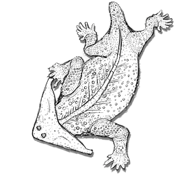
The first two are a Ghost and Wraith. Below are a pair of T'lan Imass, undead Unique to the Malazan world who can turn to dust and carry Flint weapons. The big lizard is mentioned bellow.

After I drew the Earth Elemental I wanted to go with a less anthropomorphic look for the others which fits better with the books. I'd like to re visit the earth elemental at some point.

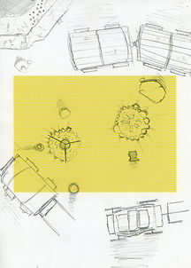
My game starts with the players escorting a Caravan between two cities. Some of the first tokens I drew therefor were for the caravan itself. When I drew these I had not fixed on my colour Key, so they are colour too similar to the background.
K''Chain Che'Malle- K'ell Hunter
One token gave me especial trouble, as trying to translate what essentially boils down to an armoured dinosaur with swords for arms into an image that does not look comical. In the books you accept them immediately, I want viewers to be able to do the same. Having become rather frustrated with many online depictions of them, I was determined to produce my own, following the books as closely as possible.
In the process of producing the token, I ended up creating a full illustration of both the living and dead versions of a K'ell Hunter. You can find the full processes of the project on my Artstation.


